- Joined
- Mar 28, 2024
- Threads
- 39
- Messages
- 273
- Reaction score
- 271
- Location
- Switzerland
- Vehicles
- Macan 4
- Thread starter
- #1
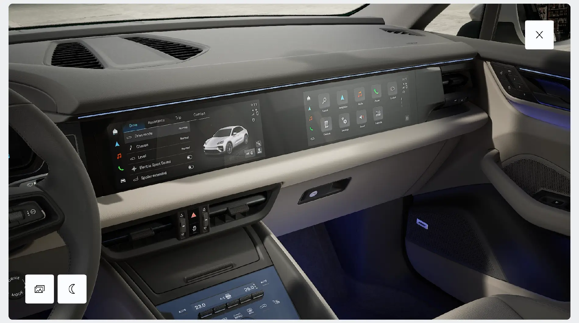
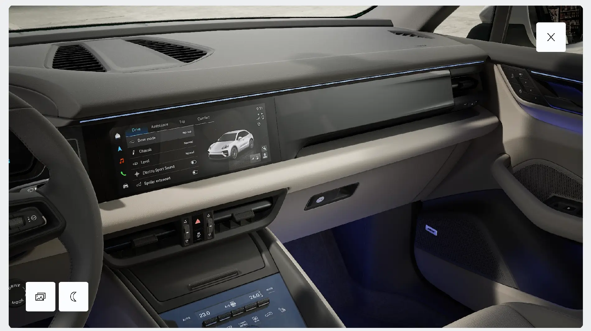
I was playing around with the config and noticed that having just one display works better with the dashboard design. The vents under the centre display match up nicely with the curve next to it. But if you add a second display, that curve gets pushed all the way to the edge of the dashboard, right next to the right vent.

 e
e


Sponsored
